Tips for creating the best presentation

Tips Trick and Technique for creating and delivering Powerpoint and Keynote Presentation

  • Home
  • Professional Template
  • Inspiring Slide
  • Slide
  • Article
  • Video
  • About
  • My account

Best Presentation Slides for Your Reference

August 7, 2013 by Muhammad Noer

Most presentation slides sucks.

This is because people trying to include so many information into a slide.

As a result, the slide is hard to understand and looks messy.

Then, how to make a good presentation slides?

Here are simple tips and example of best-designed presentation slides for your reference.


1. Simple

Simple is beautiful. Simple slide can communicate better. It is easy to understand, and people instantly know what you are talking about.

Here is sample of slides using simple approach:

Slide2   Slide3

Slide4   Slide5

Slide6   Slide7


2. Visual

A good slide has strong visual. Choose the right image to communicate your message. A good image worth more than a thousand words. That’s why if you can make a good presentation slide with good visual, you don’t need much text.

Look at samples of presentation slides below.

Slide1   Slide1

Slide1   Slide1


3. Contrast

If you want to design a good slide, make sure you have enough contrast. This is the most important thing in slide design. Contrast helps you emphasize key message. Contrast makes your slide interesting. Contrast makes audience keep listening to you.

Take a look sample of slides with good contrast below. As you can see, contrast can be created using colors, fonts, or size.

Slide2   Slide1

Slide5   Slide1


4. Consistent

Have you ever seen a slide deck with so many colors that makes you confuse?

Color is good, as long as you use it consistently.

Before you design a slide, decide what colors you wants to use. The chosen colors will be your color scheme.

Use it consistently and repetitively to create connection between a slide to another. Audience will understand they belong to the same communication. A harmonized communication.

A good presentation slides below shows you how colors can make a harmony in your slides.

Slide1   Slide4

Slide9   Slide15


Next time you make a presentation slides, make sure to make it simple, visual, contrast and consistent.

If you want to get inspiring slide above, you can get it from here.

Filed Under: Slide Tagged With: Best Presentation, best slides, Presentation Design, reference presentation

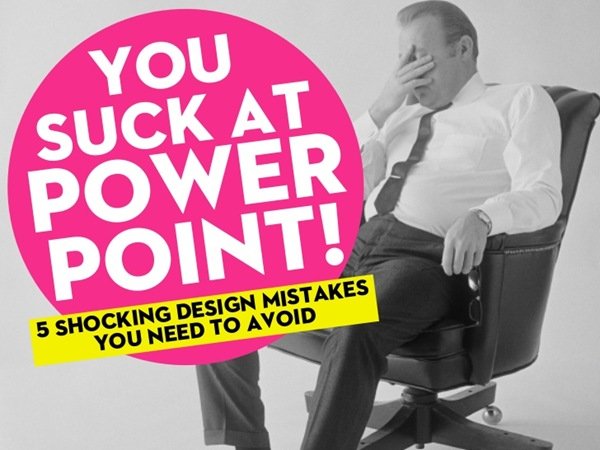
You Suck At PowerPoint – 5 Terrible Mistakes in Making Presentation Design

March 4, 2013 by Muhammad Noer

you-suck-at-powerpoint

Are you suck in making PowerPoint slides?

PowerPoint and other presentation software does not suck.

It is the speaker/designer/presenter who use it that suck.

The following slides from Jesse Desjardins explains 5 terrible mistakes in making presentation design with PowerPoint.

Look at to those slides carefully and read detail explanation below.

You Suck At PowerPoint! by @jessedee

View more presentations from Jesse Desjardins – @jessedee


1. Too Much Information

mistake-1-too-much-info

The most common mistake people make is when they try to put too much information into a slide and overall presentation. This act will make your audience difficult to understand the meaning of your slide.

Remember, your audience has cognitive limitations. Especially when there is not much time provided in a presentation. That’s why you’ve got to select and summarize every information to include in your presentation slide carefully. Use visuals and short sentences. Make it simple but powerful.

If there is too much words displayed in a slide, the audience will focus their attention to read the slide and will ignore you as a presenter. People can not reading the words and listening to you at the same time. They have to choose between reading and understanding the slides or listening to you.

So, choose a brief, relevant, and precise word. Make sure that each slide has only one main idea, so it can influence your audience effectively.


2. Not Enough Visuals

mistake-2-not-enough-visuals

Presentation slide is visual aids. Use slides to display fascinating visuals. Use pictures, diagrams, or videos that will inspire your audience.

Don’t make a slide that only contains bullet points. Your audience will get bored easily.

You can add some picture or image into your slide. There are many sites you can visit to get good picture both free and paid. Flickr or Compfight offer free images under Creative Commons license. You only need to put credit to the image’s owner. Alternatively, you can try high quality paid images from a site like iStockphoto.

When choosing an image, make sure it is relevant and supporting the message you want to deliver. An image is not for decoration. The more important function of an image is to reinforce your message. A good image will trigger your audience emotion.

Do this correctly, and your slide will become a means of visual communication.


3. Terrible Quality

mistake-3-crap-quality

Sometimes you have selected some images, diagrams or video to be included in your slide. But unfortunately the quality is terrible.

You’ve got to find some images with good quality. You can get high-resolution images easily from image-sharing sites like Flickr. You just need to spend some time to choose it carefully.

Another thing you have to note is the way you organize the image. Find a way to make it looks harmony in your slides. Make sure the image is not distorted. Discard non-essential parts of the image, to make it focus and having a powerful message.

Font is another visual aids to use. There are many kinds of font you can use beside the standard font. By browsing a little or going to a site like Dafont you can get a fine and attractive fonts. Make sure that the font you’ve chosen consistent with the theme of your presentation, not the other way around.


4. Messy Arrangement

mistake-4-visual-vomit

A good presentation slide has to follow the principles of design.

Create contrast in your slide. It is important in a visual display. Arrange each element neatly and be sure it is linked to one another. Repetition on certain elements can help to integrate them. Bring closer mutually connected elements and give some distance to different elements.

Use consistent color in your slide. It would be better if you have chosen before a set of color palette containing of 3-5 different colors that you can use consistently in your presentation. This will maximize the appearance of your slide.


5. Lack of Preparation

mistake-5-lack-of-preparation

This is the most common mistake people make in making a slide; creating a presentation slide in a hurry without sufficient preparation. You can guess the result: a presentation slide with pathetic quality.

According to a survey, 86% of top executives say that strong and clear communication has a direct impact on their careers and income.

Yet, only 25% among them spend more than 2 hours to prepare their important presentations.

Remember, the quality of your presentation has direct correlation with your preparation. If you think your presentation is important, set your time to make a good preparation.

That’s all the five terrible mistakes in making a presentation slide design.

Avoid these five mistakes and be an inspiring presenter.

Filed Under: Slide Tagged With: Jesse Desjardin, PowerPoint Presentation, Presentation Design, Presentation Design Mistake, You Suck at PowerPoint

Cart

About Best Presentation

noer-gravatar[1]

BestPresentation.net provides tips, techniques and tricks for you to deliver a world-class presentation. Written in simple language, you’ll learn how to create amazing presentation in every occasion.
Click to learn more...

Latest Post

  • How to Reduce PowerPoint File Size: 3 Quick Tips To Help You Out
  • Want Your Audience Keep Listening to You? Check This Out!
  • Start Your Presentation with Villain
  • How to Use Storytelling in Presentations
  • 5 Things to Remember Before Doing Online Presentation
  • The Simple Tips for Your Presentation from the World Class Presenters
  • How to Avoid Boredom in Delivering Same Topic Presentation Frequently?
  • Why Smiling is Good for You When Giving Presentation?
  • 7 Tips How To Communicate At The New Workplace
  • Who Said Introverts Can’t Be Great in Public Speaking?

Categories

  • Article (45)
  • Slide (7)
  • Video (4)

About Us

Best Presentation is aiming to give you practical tips on how to create a great presentation. We believe everyone can learn how to create a better presentation, deliver a great speech and show amazing visual slides.

Products

We created wide-ranging presentations template products from Inspiring Slides to Powerful Business Presentation. Click below for the products:

  • WOW Presentation
  • Inspiring Slides

Contact Us

Email:
support@bestpresentation.net

Address:
Level 38, Tower A, Kota Kasablanka
Jl. Casablanca Raya Kav 88
Jakarta – INDONESIA

Home Top – Download

home-download-world-class-slide

Recent Post

  • How to Reduce PowerPoint File Size: 3 Quick Tips To Help You Out
  • Want Your Audience Keep Listening to You? Check This Out!
  • Start Your Presentation with Villain
  • How to Use Storytelling in Presentations
  • 5 Things to Remember Before Doing Online Presentation

Copyright © 2025 · Outreach Pro on Genesis Framework · WordPress · Log in