Tips for creating the best presentation

Tips Trick and Technique for creating and delivering Powerpoint and Keynote Presentation

  • Home
  • Professional Template
  • Inspiring Slide
  • Slide
  • Article
  • Video
  • About
  • My account

Body Language Tips to Deliver Convincing Presentation

April 14, 2013 by Muhammad Noer

al-gore-gesture-body-language

Giving a presentation is also about the ability to communicate to your audience. It comprises tone of voice, slides or body language.

A presentation would not be effective without the support of body language. Therefore, presenting the right body language is essential to make your presentation powerful. You must avoid using body language that contradicts your presentation.

Body language or gesture is a natural response of your body. It reflects your true feelings. If you feel nervous, anxious or unsure, these feelings will find manifestation in your body. As a good presenter, you should present your body language to your advantage by showing you are positive, open and confident.


Avoid Negative Body Language

You might have noticed somebody who crosses his legs, hands in his pockets, or hands held behind his back.

These are examples of wrong body languages you should avoid during a presentation.

Hands in the pockets

Putting your hands in the pockets shows that you are not truly open to your audience, and you look unsure of what you are saying. Try to avoid this gesture and keep your hands out of your pockets.

Hands behind your back

This posture has similar impression as putting your hands in the pockets. You will look reserved to your audience.

Unbalanced Stance by Leaning on One Foot

Sometimes you find a presenter delivering his presentation with unbalanced stance, leaning on one foot and letting the other one relaxed. This slouching posture is certainly unattractive. It gives the impression that he is not presenting seriously.


Scratching Nose or Head

Presenter often repeats the same gesture, such as scratching nose or head which is obviously unnecessary. This body language occurs because of lack of confidence. You should stop this kind of habit immediately if you are delivering a presentation.


Maintain Positive Body Language

Now let me explain how to manifest the right body language. Try to practice in front of a mirror. It would be helpful if you could record it, and evaluate how you present yourself.

Stand up straight but relaxed

If you stand up straight, it shows that you are self-confident and self-assured. Feet should be apart properly and both hands relaxed by your side. You can occasionally gesture with your hands in order to underscore a point or direct your audience’s attention towards something interesting. Chest up and head high. Be confident without showing any arrogance.

Use hand gesture appropriately

If you pay attention to great presenters, they use body language to their advantage in conveying the message. They will gesture their hands to make a big circle to explain something big. They move their hands upward to illustrate growth or progression. These are gestures that you could learn to make your presentation more powerful.

Imagine if you have visual slide, strong tone of voice, and positive body language. These actions will help you guide the audience to focus on your presentation, and leave them with a memorable presentation.

Positive body language will add energy, engagement and persuasive power to your presentation.

Smile

You should smile sincerely and naturally. This pleasant expression contributes positively to your presentation. Smiling shows that you are confident and comfortable with the message you are delivering. This will help the audience feel connected with you.

Photo Credit: Paramount Classic Pictures

Filed Under: Article Tagged With: Body Language, Body Language Tips, Convincing Presentation, Presentation Tips, Speaking Tips

5 Simple Tips to Make a Great Presentations

April 8, 2013 by Muhammad Noer

The following video will explain to you 5 simple tips to make a great presentation.

These excellent presentation tips is recommended by Nancy Duarte, a communication consultant who has helped Al-Gore developed his phenomenal presentation slide “The Inconvenient Truth.”

Watch Nancy Duarte’s video below. This video was made with PowerPoint and used a world-class animation technique to create a perfect blend between the slides and presenter narration.

And here are five tips to make a great presentation:


1. Treat Your Audience as King

Your audience is a king. They come to a presentation because they need it.

Design your presentation to meet your audience needs, not just yours. Audiences want to know what is important to them. That’s why you should create a clear, simple and easy to understand presentation.


2. Spread Ideas and Move People

Audiences want to get inspiration from your presentation. They also want to benefit from your thinking. Remember, presentation is not another meeting that gets people bored. It should be able to convey meaning.

Use animation to inspire and help audience understand your message better. Encourage them to act.


3. Help Them See What You Are Saying

A picture is worth a thousand words.

When making a presentation design, ask yourself, what am I trying to communicate?

Brainstorm ideas and replace words with pictures, charts or diagrams.

Design a presentation that has a consistent appearance so that every slide will be focused on one single idea. This will help your audience easier to understand what you are saying. Don’t let their attention distracted by puzzling slides.


4. Practice Design Not Decoration

Design is different from decoration.

You are making a good design if you arrange every element consciously for specific communication objectives. Make sure that there is no picture, diagram or text, placed randomly without any purpose.

A design is very different from decoration. Decoration is only an act of adding something to decorate your slides. Unfortunately, often times it makes a presentation slide become complicated and confusing.

90% of a creative process is destructive. This means you need to reduce in order to get the essence of your message.

If you want to display a strong message, focus your statement on specific sentence that represent the main point of your presentation.

And if you want to display a powerful image, enlarge it to show its strength.


5. Cultivate Healthy Relationship

As a presenter, you are interacting with your slides and your audience. Build a good relationship with your audience and reduce your dependency on slides. Remove unnecessary text and focus on main subject.

Your slide serves as a visual communication to your audience.

Extend this function with your style of delivering the presentation. Make eye contact and use a friendly body language. This will develop trust and healthy relationships between you and your audience.

Practice a lot before you perform. Practice and repetition are very important. It will help you mastering your presentation better and cultivate healthy relationship.


Those are 5 simple tips to make a great presentation from Nancy Duarte.

Implement the tips and you will deliver amazing presentation that will be remembered by your audience.

Filed Under: Video Tagged With: Duarte's Design, Great Presentation, Nancy Duarte, PowerPoint Presentation, Presentation Tips

Three World Class Speech Techniques

April 3, 2013 by Muhammad Noer

Obama, Al-Gore and Steve Jobs are those among the great speakers who deliver impressive speeches. They use certain techniques to deliver their presentations which grasp the audience’s attention.

You surely can do the same thing. As follows are the secret of the world’s class speech techniques. You can use these three techniques in your presentation:


1. The Rule of Three

Since long time ago, speech writers have known the secret behind “The Rule of Three”. This technique simply divides the main idea into three parts.

Steve Jobs frequently used this technique in all his presentations by saying, “Today, I want to talk about three things.” Then he would start to explain part by part. This way the audience understands clearly and remembers well every part of it.

Grouping the idea into three parts always give strength. Other than three would not have the same effect. Squeezing the idea into two parts would be unattractive, but more than three would be too many and difficult to memorize.

Use this technique and experience how your message becomes powerful.


2. Anaphora

Anaphora is a repetition of a word or some words in sequential phrases. The purpose of this repetition is to give emphasis on a particular message, therefore the audience will always remember. Anaphora combined with the right tone of voice will create a dramatic effect, especially towards the end of the presentation.

An example of a very famous anaphora is the one from Martin Luther King’s speech, when he repeated eight times the phrase of “I have a dream”. These are the quotations:

“Let us now wallow in the valet of despair, I say to you, my friends.

And so even though we face the difficulties of today and tomorrow, I still have a dream. It is a dream deeply rooted in the American dream.

I have a dream that one day the red hills of Georgia, the sons of former slaves and the sons of former slave owners will be able to sit down together at the table of brotherhood.

I have a dream that one day even the state of Mississippi, a state sweltering with the heat of justice, sweltering with the heat of oppression, will be transformed into an oasis of freedom and justice.

I have a dream that my four little children will one day live in a nation where they will not be judged by the color of their skin but by the content of their character.

I have a dream today!

I have a dream that one day, down in Alabama, with its vicious racist, with its governor having his lips dripping with the words of “interposition” and “nullification”-one day right there in Alabama little black boys and black girls will be able to join hands with little white boys and white girls as sisters and brothers.

I have a dream today!

I have a dream that one day every valley shall be exalted, and every hill and mountain shall be low, the rough places will be made plain, and the crooked places will be made straight; “and glory of the lord shall be revealed and all flesh shall see it together.”

When you deliver a presentation, try to convey your important message in one word or few words at the right moment. Practice with the word using several phrases before the actual presentation, you will surely present a compelling anaphora which will impress your audience.


3. Hyperbole

The term hyperbole is known as an act of exaggeration on something in order to emphasize a point. You might remember certain examples given when you were still at school such as:

The house is as big as a castle .

(Although the house is big, but there is small possibility to be equally big as a castle with hundreds of rooms)

His thundered voice bursts my ear.

(Even a person with the loudest voice will not damage your ear)

Use this technique attentively to emphasize only the important point. The right hyperbole technique will create a dramatic effect in your presentation.

Here are several examples of phrases to help your imagination:

Today I will reveal a secret that could change your world.

(Most probably the message you pass on would not change somebody’s world, but it could considerably make a difference).

I will introduce you a revolutionary product which is a great discovery of this century.

(A great discovery in the century should be something that has been widely-spoken. Even if your product is not as great, you could use the same phrase to show your revolutionary product has its own advantage compare to other product)

These are the 3 techniques of world’s class speech that you can apply in your presentation.

Use it wisely and be a compelling presenter in every opportunity.

Filed Under: Article Tagged With: Martin Luther King, Obama, Speech Techniques, Steve Jobs

How to Present Numbers for an Attractive Presentation

March 10, 2013 by Muhammad Noer

A good presenter will always try her best to deliver an attractive presentation. This includes how to present numbers in an interesting way. Those who often deal with numbers will surely want to have their numbers well presented, understood and appreciated by the audience.

In this article, I will explain how to present numbers to make your presentation more attractive. This article will also address frequently asked questions regarding how to present number in an effective way.

Questions:

I got a question from one of the readers, Edi Mantawijaya:

“How do I present numbers to be more effective?

To tell you the truth, I can’t avoid numbers, particularly in presenting a financial report which deals with numbers in a standard format.

Perhaps there are some tips to make it more informative, and of course more interesting? Thank you.”

Similar question comes from another reader, Tri Hariyanto:

“Almost every 2 weeks, I have to make a presentation which includes data and chart. Using different chart for different purpose has been explained in this blog. I want to know how to present data but don’t want to make it a boring presentation.

Thanks a lot!”

Answers:

Here are my answers.

Numbers is Different from Images and Words

The first thing you should remember is that numbers is different from images and words. If you present an image, audience could create an association. This is the strong point of using image. The same thing occurs with words. If you choose the right words your presentation will be powerful.

That’s images and numbers. How do I present numbers? As numbers have to be presented as it is, isn’t?


Help Your Audience to understand the Numbers Shown

Number is abstract thing. Nobody could easily imagine a number. Number is not only abstract, but also relative. Its value depends on another number being used as comparison.

For example, what is the meaning of 6% economic growth? For those who don’t have any economic background would think 6% is just a small number. However, this number is considered as one of the highest economic growth rate in the world at this time around.

Hence, you have to make the audience understand the story behind the number. Don’t just tell them that the prediction for Indonesian economic growth is 6%. Yet, explain that the 6% of economic growth is one of the best in the world.

Steve Jobs was one of profiecient speakers especially when presenting numbers. When he was explaining the capacity of an Ipod, he didn’t mention 1 gigabyte, 2 gigabyte or 100 gigabyte. Why? Because those numbers were abstract to the audience. Instead, he explained that you could store up to 1000 songs in your pocket. The number then had a meaning and a story.

Steve Jobs also said that 5 million songs were being sold every day on iTunes, which seems a big number to the audience. To make it easier for the audience to understand, Jobs gave an analogy that the number is equal to 58 songs sold every second of every day. Now the audience can imagine the number clearly. That’s the story behind the number.

clip_image001

When you present numbers, try to bring up the story behind. Don’t simply say that the sale of our product has increased 20%. But, explain that the number represent a combination of our 3 closest competitors. The number then becomes meaningful.


Use A Simple Chart to Present Numbers

A presentation should use simple chart rather than pointing directly to a table. Table is difficult for audience to understand right away, unless they have information about it beforehand. You certainly don’t want your audience to frown because of the way you present the numbers.

Transforming numbers into a chart would help the audience to understand better. The numbers will no longer appear abstract, but becomes visually comprehensible because there is comparison.

Here is an example. The following slide shows a table which presents sales of a product in numbers. Such data would not be readily understood by the audience. Only those who are good in counting could do the comparison. Though, it would take time to come out with a conclusion after analyzing these numbers.

X’s product sales in Indonesia

clip_image002

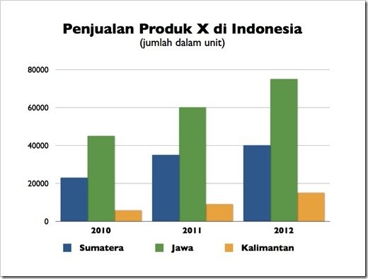
Now if you compare the same data but presented on a simple chart, the data would be more comprehensible. The actual numbers are not important, but the chart emphasizes the comparison between numbers.

The audience immediately becomes aware that the highest sale is in Java, followed by Sumatera and then Kalimantan. The audience should also be able to see instanly that the increasing sales in Java from 2011 to 2012 is almost in the same amount as the total sale in Kalimantan in year 2012.

X Sales in Indonesia

(By unit)

clip_image003

What if for some reasons you have to use a table to present your data?

Designing a table would be more effective by highlighting the important parts of the table, in line with its purpose.

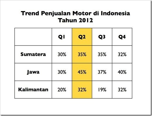
For example, the table below shows an increase in the sales of motorcycle by percentage on a quarterly basis.

You could see from the highlighted table that the second quarter represents the highest growth rate of all islands in Indonesia. The purpose of the highlight is to make the audience understand the message easily and guide their eyes to focus on specific information.

The Trend of Motorcycle Sales in Indonesia

In 2012

clip_image004


How do I Present a Financial Report?

In relation to accounting, sometimes numbers could not be presented on a chart or graph. There are also times when you can not avoid presenting numbers as it is in a financial report.

So how to make it interesting?

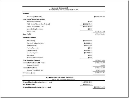
The answer is to make the numbers concise, and only show the numbers which are important for the audience to recognize. It is unnecessary to show the entire numbers. The audience would find it hard doing the counting and at the same time listening to the presentation.

You can see in the example below, a slide presenting a complete financial report full of numbers in small font. Obviously, the audience would have difficulty to observe and understand the numbers. In this case the numbers become meaningless in the actual presentation.

Most likely the presenter has no intention of going into the details in presenting the financial report. Perhaps the presenter only needs to emphasize certain components such as Revenue or Net Income.

clip_image005

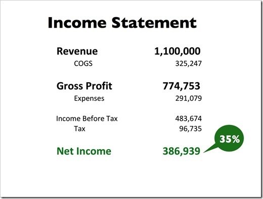
The following slide shows the same financial report, but in a version that is brief, clear and to the point. Using this way, you only show important numbers to be recognized.

This slide only focuses on the numbers pertaining to Revenue, Gross Profit and, particularly the Net Income. An additional note of 35% indicates that the value of Net Income comes from 35% of the Revenue. Actually, this is the key message that the presenter would like to convey.

Therefore, handouts which contain the details could be disseminated to the audience.

clip_image006


A Combination of Image and Number

You could project a powerful and dramatic number if you are able to combine it with the right image. Through this approach, you create a visual association with the number being presented. Here is an example from Thirst Presentation by Jeff Brenman, who won an award as the best slideshare presentation in 2008.

You could see how this slide uses a powerful image and just a simple number. This kind of slide is perfect if you wish to convey a message with simple number in a powerful way.

clip_image007

Otherwise you could use a chart to show the comparison. Choose the right chart for explaining your slide.

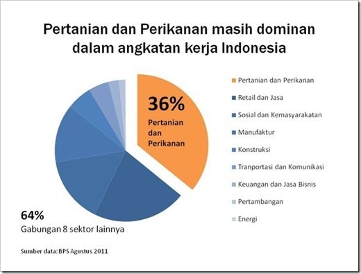
The following slide shows the Indonesian labor forces in the Agricultural sector compared to those in the Fishery sector. You could see that the data only highlights the sections that we are supposed to focus on, namely the sectors of Agriculture and Fishery.

clip_image008

The number of Indonesian Labor Forces is still dominated by the sectors of Agriculture and Fishery

  • Agriculture and Fishery
  • Retails and Services
  • Public and community
  • Manufacture
  • Construction
  • Transportation and Construction
  • Finance and Business Services
  • Mining
  • Energy

36 % belongs to the sectors of Agriculture and Fishery

64% belongs to the other 8 sectors

Hopefully, this article could help you to present numbers to be more attractive.

If you wish to learn how to use a graph correctly for a presentation, please read this following article.

You can also learn how to present a graph effectively, and highlight on the important parts of the data.

I wish you good luck for your presentation by presenting data and numbers in an interesting way.

Don’t forget you can also learn how to present inspirational slide here.

Filed Under: Slide Tagged With: Attractive Presentation, Chart, Data, Graph, Numbers

A Multimedia Presentation from a Great Magician Marco Tempest

March 7, 2013 by Muhammad Noer

Marco Tempest presenting at TED Global 2011

Marco Tempest is one of my favorite magicians. He is a Swiss magician who is not only an expert in using multimedia technology for a magic show, but also a great presenter.

In TED Global 2011 presentation, Marco Tempest delivered a fascinating presentation using 3 pieces of iPod.

The Magic of Truth and Lies, was the title of the presentation which got a standing applause from TED Global audience.

Let’s watch this video:

Download Video

Download Audio


Introduction:

Marco began his presentation with a story about his favorite magician Karl Germain who is capable of displaying blooming roses in front of the audience eyes.

He created some conspicuous phrases in this presentation to be the core of his presentation:


Magic is the only honest profession.

A magician promises to deceive you and he does.

A story or narration is one of the best ways to open a presentation. The reason for this is simple, everybody loves stories. Young children, teenager, adult, even older person, all like story. In this presentation Marco uses his skills as a great story-teller.


Contents:

He gave the presentation with 3 iPod as the instrument to support what he is talking about. Look on how he carefully telling one story after another to generate curiosity and interest of his audience.

When he talked about lies, he took a simple example of how people lie on the phone. And to enforce his point, he used a polling result showing that men tell lies two times more than women.

He also used the saying of Sun Tzu, the great Chinese general and an expert of war strategy, “All warfare is based on deception.”

Another unique style of Marco is his capability to combine technology, games, entertainment, and magical show in his presentation.


Closing:

At the end of his presentation, Marco used this statement:

“Art is a deception that creates real emotions — a lie that creates a truth. And when you give yourself over to that deception, it becomes magic.”

This is spectacular closing of technology intensive magic show and presentation by Marco Tempest. The closing sentence was chosen in such a way to summarize the contents of presentation very well.


Presentation Analysis:

Whatever tricks he used in the presentation, you would agree that he presented it very well and fascinating.

Certainly it is because of intensive and well-done preparation. A feature that made him capable of delivering his speech very well. Every sentence was pass on smoothly at the right moment.

In a “LIVE” presentation like this, there is almost no tolerance for mistakes. Marco was capable of presenting an attraction as well as appealing sentences in every part of his presentation.

So, if you want to deliver a great presentation, there is only one condition you have to follow: prepare your presentation carefully and practice a lot.

  • Choose an interesting story to open your presentation.
  • Prepare specific phrases and sentences that you want to say on certain moments.
  • Design a show or demonstration that will support your presentation.
  • Create a powerful presentation’s closing that will always be remembered by the audience.

What Marco did is similar to Steve Jobs, who always practice seriously for each presentation session including when he has to give a product demonstration. With this careful preparation, no part will be missed when he presented important features of a product. Everything looks natural because of continuous practice. Finally, this will bring about a stunning appearance in a presentation.

We can learn a lot from Marco Tempest’s presentation. We don’t have to always use a slide in a presentation. You can perform a stunning presentation by demonstrating a certain skill, including magic.

What do you think?

Filed Under: Video Tagged With: Magic, Marco Tempest, Multimedia Presentation, TED, TED Global, The Magic of Truth and Lies

  • « Previous Page
  • 1
  • …
  • 8
  • 9
  • 10
  • 11
  • Next Page »

Cart

About Best Presentation

noer-gravatar[1]

BestPresentation.net provides tips, techniques and tricks for you to deliver a world-class presentation. Written in simple language, you’ll learn how to create amazing presentation in every occasion.
Click to learn more...

Latest Post

  • How to Reduce PowerPoint File Size: 3 Quick Tips To Help You Out
  • Want Your Audience Keep Listening to You? Check This Out!
  • Start Your Presentation with Villain
  • How to Use Storytelling in Presentations
  • 5 Things to Remember Before Doing Online Presentation
  • The Simple Tips for Your Presentation from the World Class Presenters
  • How to Avoid Boredom in Delivering Same Topic Presentation Frequently?
  • Why Smiling is Good for You When Giving Presentation?
  • 7 Tips How To Communicate At The New Workplace
  • Who Said Introverts Can’t Be Great in Public Speaking?

Categories

  • Article (45)
  • Slide (7)
  • Video (4)

About Us

Best Presentation is aiming to give you practical tips on how to create a great presentation. We believe everyone can learn how to create a better presentation, deliver a great speech and show amazing visual slides.

Products

We created wide-ranging presentations template products from Inspiring Slides to Powerful Business Presentation. Click below for the products:

  • WOW Presentation
  • Inspiring Slides

Contact Us

Email:
support@bestpresentation.net

Address:
Level 38, Tower A, Kota Kasablanka
Jl. Casablanca Raya Kav 88
Jakarta – INDONESIA

Home Top – Download

home-download-world-class-slide

Recent Post

  • How to Reduce PowerPoint File Size: 3 Quick Tips To Help You Out
  • Want Your Audience Keep Listening to You? Check This Out!
  • Start Your Presentation with Villain
  • How to Use Storytelling in Presentations
  • 5 Things to Remember Before Doing Online Presentation

Copyright © 2025 · Outreach Pro on Genesis Framework · WordPress · Log in