Tips for creating the best presentation

Tips Trick and Technique for creating and delivering Powerpoint and Keynote Presentation

  • Home
  • Professional Template
  • Inspiring Slide
  • Slide
  • Article
  • Video
  • About
  • My account

How to Choose A Good PowerPoint Template for Your Presentation

July 11, 2015 by Muhammad Noer

WOW Presentation Professional PowerPoint Template

A good presentation can be supported by using a good presentation template.

The right PowerPoint template will help you show ideas clearly. It makes your presentation look professional, consistent and, elegant between one slide to another.

Unfortunately, standard presentation templates available in PowerPoint in my opinion is not good enough.

Your presentation looks too common and mediocre by using such templates. Even some template has a conflicting color combination. It looks busy and uncomfortable to the viewer’s eyes.

Then, how you choose a good presentation template?

Here are the characteristics of a good presentation template for your reference:


1. The template gives you enough room to fill in content

This is the main requirement when you choose a template.

Good template gives you enough room to be creative.

You can add images, graphics, or text to visualize your ideas.

Remember the presentation template is the background of your presentation.

The template presentation should not be too dominant that move attention from the content to the template.

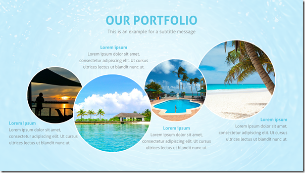
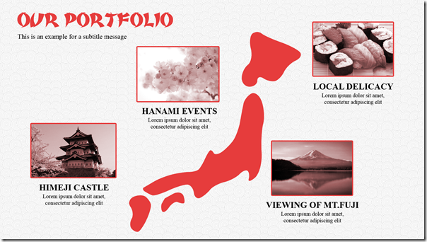
Good Presentation Template - Portfolio 

Good Presentation Template - Portfolio 2


2. Using harmonious and consistent color

A good presentation template usually using colors harmoniously. This is very important because the right color combination will create comfort and looks professional. Audiences can easily see a slide-by-slide with consistent color.

Avoid using a presentation template that use too many colors. Remember, too many colors will create distraction and visual fatigue for your audience.

Good Presentation Template - Layout 

Good Presentation Template - Team


3. Good Font Combination that Match With The Presentation Template

In addition to giving you enough space to fill in and harmonious colors, a good template provides a carefully selected font.

The font that match with the presentation template itself so it looks attractive, visually beautiful, and consistent.

For example, formal template for business presentations should use formal fonts. On the other hand, more creative presentation can use a unique or fancy font.

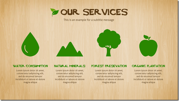
Nature - WOW Presentation Template

Nature - WOW Presentation Template - Our Services


4. Enable you to create a good visual communication layout

A good template should help you to create a good visual communication.

For example, when you want to create a title, a good presentation template will provide a slide title that dominant and powerful to attract audience attention right from the beginning.

When you want to use picture, a good template also helps you in selecting the right layout.

The same thing when you want to create a chart. It will provide a good layout options for your chart.

Therefore, you can adapt the template with your content easily.

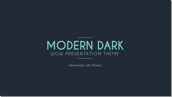
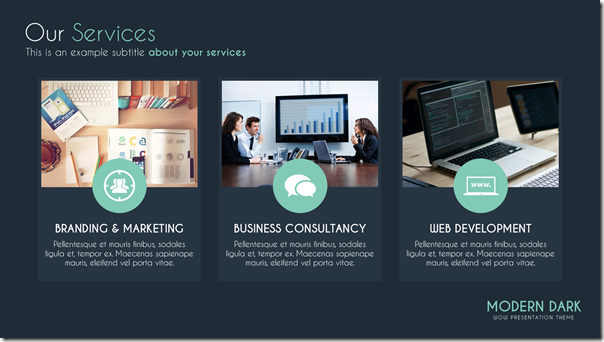
Modern Dark - Professional Presentation Template

Modern Dark - Professional Presentation Template - Our Services

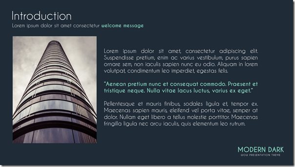
Modern Dark - Professional Presentation Template - Introduction

Modern Dark - Professional Presentation Template - Bar Chart


5. Presentation Template should match with your content

There is no template suit in all situation.

Each presentation is unique and requires a unique look as well.

When you deliver a formal presentation to the board of directors, investors, or your boss, then you need to choose formal or corporate style template. Despite the formal nature, your presentation will still look attractive and elegant.

Please take a look the following examples of good template:

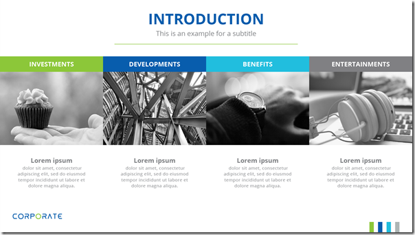
Corporate Presentation Template

Corporate Presentation Template - Partner


Conversely when you make a presentation for birthday parties or other informal events, use a more fancy and creative template.

It will make your presentation look fresh and stylish.

Please see below example:

Creative Presentation Template

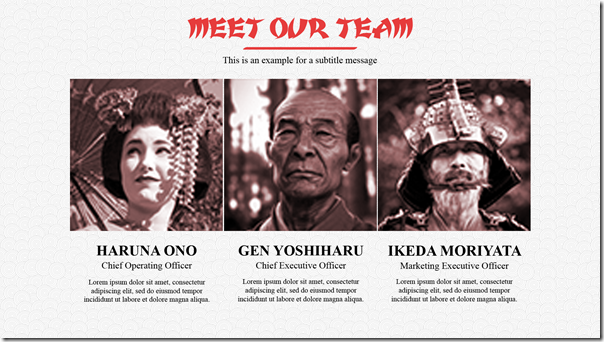
Creative Presentation Template - Team


Those are five characteristic of a good presentation template.

The question is, where you can find presentation templates like that?

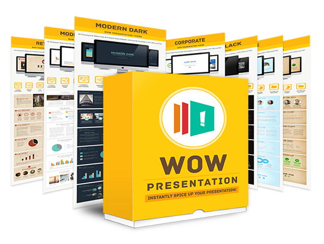
Introducing easy to customize PowerPoint template “Wow Presentation”

WOW Presentation Professional PowerPoint Template

This product is specially designed to help you creating a world class presentation quickly and easily.

This is a multi purpose PowerPoint templates that will help you prepare for important presentation.

A collection of the best presentation slides that can be edited easily.

A complete combination of a nice, simple and visually beautiful presentation template.

You can get 12 prefessionally designed templates only for $17 here.

Do you have other view of a good presentation template?

Please share in the comment.

Filed Under: Slide

Best Presentation Slides for Your Reference

August 7, 2013 by Muhammad Noer

Most presentation slides sucks.

This is because people trying to include so many information into a slide.

As a result, the slide is hard to understand and looks messy.

Then, how to make a good presentation slides?

Here are simple tips and example of best-designed presentation slides for your reference.


1. Simple

Simple is beautiful. Simple slide can communicate better. It is easy to understand, and people instantly know what you are talking about.

Here is sample of slides using simple approach:

Slide2   Slide3

Slide4   Slide5

Slide6   Slide7


2. Visual

A good slide has strong visual. Choose the right image to communicate your message. A good image worth more than a thousand words. That’s why if you can make a good presentation slide with good visual, you don’t need much text.

Look at samples of presentation slides below.

Slide1   Slide1

Slide1   Slide1


3. Contrast

If you want to design a good slide, make sure you have enough contrast. This is the most important thing in slide design. Contrast helps you emphasize key message. Contrast makes your slide interesting. Contrast makes audience keep listening to you.

Take a look sample of slides with good contrast below. As you can see, contrast can be created using colors, fonts, or size.

Slide2   Slide1

Slide5   Slide1


4. Consistent

Have you ever seen a slide deck with so many colors that makes you confuse?

Color is good, as long as you use it consistently.

Before you design a slide, decide what colors you wants to use. The chosen colors will be your color scheme.

Use it consistently and repetitively to create connection between a slide to another. Audience will understand they belong to the same communication. A harmonized communication.

A good presentation slides below shows you how colors can make a harmony in your slides.

Slide1   Slide4

Slide9   Slide15


Next time you make a presentation slides, make sure to make it simple, visual, contrast and consistent.

If you want to get inspiring slide above, you can get it from here.

Filed Under: Slide Tagged With: Best Presentation, best slides, Presentation Design, reference presentation

6 Principles to Create A Good Slide for Presentation

July 18, 2013 by Muhammad Noer

Slides for Presentation

A good presentation slides will help you in delivering a good presentation. Before opening PowerPoint software and creating your slide, you need to understand what the role of a slide in a presentation is.

In this article, you will learn slide as visual aid and how it complements your role as a presenter. You will also learn key principles to make slide for presentation.


Slide and Visual Aid

Basically, slide has a function to support your presentation. Slide is not the presentation itself. The role of slide as presentation aid is different than your role as a presenter. Slide is necessary to explain something which is difficult to describe it only with words. We know that an image could represent a thousand words. A good slide should be able to summarize the message to make the audience understand it easily. Additionally, using a slide, you can present a trend, comparison, and highlight key points that is more difficult to be explained by words.

Don’t forget, slide is not the only visual aid for presentation. There are many other visual aids that you can use, such as flipchart, video, sample of product, and other things. Don’t just stick to slide when it comes to visual aid in your presentation.


Basic Principles to Create a Good Slide

There are several basic principles that should be carried out to create a good slide for PowerPoint presentation. If you follow these principles, your slide will function as a tool to aid your presentation. Your slide will not be the problem that could divert the audience’s attention from the presentation itself.

Following are the principles:


1. Simple

The best slide is usually simple, easy, and to the point. Your audience is busy people. They have so many things to do. They have so many concerns. Help them with simple and to do point PowerPoint slide.

This kind of slide will offer you flexibility in giving explanation. The more complicated a slide, more time would be needed for the audience to understand. In some cases, you will face difficulty in explaining the slide.


2. Necessary or Unnecessary

Before you make any slide for your presentation, ask yourself, “Is it necessary?”

Think why you need the slide before actually creating it.

Ask yourself, “Do I need 10 slides or just 5 slides should be enough?”

“Could I combine several slides into one?”

“Could I replace the slide with a brief explanation to the audience?”

Just asking yourself with these questions will help you creating an effective and efficient slide. A slide that is necessary and not just nice to have.


3. Background and Readable Font

Today, you have a choice among thousands of backgrounds and fonts available. You will be tempted to use and experiment with so many choices.

Any combination should be okay as long as you create enough contrast between background and font. If you choose dark background, make sure to use light font color so it will be easier to read and vice versa.

Preferably, choose maximum 2 fonts for one slide. You can also use these 2 fonts for the entire presentation.

Why? Because too many fonts will make your audience’s eyes tired. Your audience will get confused because they cannot see consistency and connection between slides. A good font for presentation is the one that does not have too many decorations. It should be easy to read such as: Arial, Verdana, Trebuchet. You can use decorative font for title or supporting text, but not for the body text.


4. Avoid Bullet, Use Less of It

When possible, avoid bullet point. It is the most boring slide that makes people feel asleep.

But if you must use it, make sure they are less than 7 bullets in a slide.

Too many bullets will make the font getting smaller and unreadable. No need to create a slide if your audience cannot read it. Use slide as a summary of your thought and ideas, not as your speaking notes.

If you have more than 7 items to show, try to make it less and concise. Remember, maximum 7 lines. Less is always better.


5. Image, graphic and diagram

Slide is visual aid to help you explain complex ideas in an easy way. Therefore, use image, graphic, chart or diagram to show your ideas visually. A good slide can summarize complex things into simple visualization which is not easy to be explained orally. Therefore, take the advantage of using a good image, graphic and diagram.

Choose the right image to support your thought. The right image could represent a thousand words. On the other hand, wrong image can create confusion. Image should be relevant with the content and able to help the audience understand your explanation. On the contrary, irrelevant image will distract audience’s attention as they have difficulty to associate the displayed image with the content of your presentation.

In term of graphics or charts, there are numerous graphics that you can use to support your presentation such as bar, pie chart, line, or combination of those. You have to pick the right graphic to have a great influence on the audience so they will understand easily the content of your presentation.

For instance, bar chart is the most common and suitable graphic to explain growth for a certain time period. Pie chart is best used to show proportion comparison. The round shape of cake makes the audience easy to associate the portion of cake to make comparison. Line chart is relevant to show a trend within longer period of time. Understand what you want to communicate first then select the best chart for it.

Diagram is very useful to explain the steps of a process and the relationship between them. Therefore, the audience will understand effortlessly the most difficult part of the presentation.


6. Use Color Combination with Good Contrast

Choose several colors for your slides. Use colors that have enough contrast especially between the background and the content. Use colors in a consistent way and repeat it in your slide decks. Do not use different colors in every slide, because it will create distraction to your audience as well as it looks unprofessional.

Those are the 6 principles that you should know in making a great presentation slide.


Final Thoughts

You might also wonder about how to use template which has various colors and styles? After all, you can use template that follows the principles above. Try to select template without complex background that could take more space and attention in your presentation. This is important, because the template background will show-up in every presentation slide from the beginning to the end.

What about animation, transition’s effect between slides, and the use of sound? You must pay attention carefully on these matters. Regarding to animation, motion image or image that changes frequently could distract the audience’s attention easily. So, you should ask yourself whether it is necessary or not for your presentation. In certain condition animation could be useful to explain a complicated technique process in a way that the motion image will show how the process works. Other than that, I suggest not to use animation.

Furthermore, you should pay attention on the transition between slides and how the text would appear on the screen. In this regard, I am more conservative and rather choose the simple transition such as Appear or Fade in PowerPoint. The reason is, this kind of transition does not cause too much of distraction. Besides, if you use it appropriately it will add strength to your presentation. For example, if you explain a diagram which presents stages and you want the audience to see each stage, then you should use this kind of transition. Avoid using transition that makes the text spinning around or moving sideways from left to right, the letter appears one by one along with the sound of gunfire and other exaggerating accessories.

Finally, I don’t recommend to use sound, unless, you are showing a video in the presentation. Many presentations look very unprofessional and might disturb the audience’s attention when every paragraph appears with the sound of gunfire, hand clapping, or camera shoot. Be aware that you are delivering a presentation not presenting a special effect of a film.

Hence, those are the guidance that you can use as reference to create presentation slide. Hopefully this guidance will help you to prepare the slide very well and effectively. After all, slide is only a tool which aimed to support the success of a presentation.

If you have any comment about this, please share your point of view.

Filed Under: Slide Tagged With: Good Presentation, Great Presentation, How to Make a Presentation, How to Make a Slide, Principles in Making Slide

How to Avoid Death by PowerPoint

July 8, 2013 by Muhammad Noer

death-by-powerpoint

Death by PowerPoint is a term used to describe a situation caused by a boring and unbearable presentation. As a result, the presentation becomes meaningless and fails to keep the audience’s attention.

This term was first introduced by Angela R. Garber in the article for Small Business Computing. It was addressed to criticize a boring and tiring situation due to laborious information which includes power point in the presentation.

So, how to lighten-up your presentation and grab the attention of your audience?

Look closely to the presentation made by Alexei Kapterev and his explanation.

Death by PowerPoint from Alexei Kapterev

Death by PowerPoint from Alexei Kapterev


According to Alexei Kapterev there are four things that we should pay attention in order to avoid having a boring presentation, such as:

  1. Significance
  2. Structure
  3. Simplicity
  4. Rehearsal

Let’s take a look each of them.


1. Significance

By the dictionary, significance is a quality of something worth to be recognized or something signified.

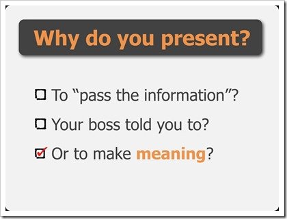
What is the real reason we give a presentation? Is it to pass-on the information? Is it because of the Boss’ instruction? Or you really want to give something meaningful.

why-do-you-present

To make a presentation worthy, we have to look deeper into the issue of the topic. Understand why the topic matters to us and why it is important to explain it in a presentation.

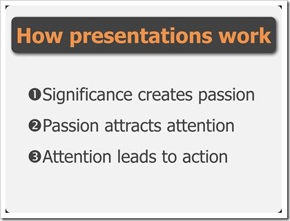
As a person who makes the presentation, you will wish to convey a meaningful presentation. At the same time you are also building a strong passion.

how-presentations-work

What is passion? Passion is emotion, desire and enthusiasm to be able to offer the best. You would like to invite your audience to care and to understand about the problem you convey.

Passion will be reflected through the slides, words and body language you presented.

Be passionate, so that your audience will not die of boredom.


2. Structure

A good presentation will not only use impressive and inspirational slides but it also has a strong structure.

How to make a good structure?

According to Alexei, you could make any structure as long as it’s:

  • Convincing
  • Memorable
  • Scalable

You can use the structure of Problem – Pathway – Solution

In this structure, you will first introduce the problem. Then give explanations to show the way to solve the Problem.


Another form of structure is Problem – Solution – Reasoning

Firstly, introduce the problem, and show the solution. Then explain why the solution you have offered is the best one.

Give three to four points only, because more than that would be difficult for the audience to remember.

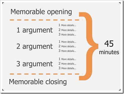
More or less, the form will look like this:

structure-of-presentation

This way you could adjust your presentation according to the length of time. You could explain your entire presentation if you have 45 minutes.

With 15 minutes, you could briefly explain every argument. But if you only have 5 minutes, you could still able to explain the essential points of the argument without going into details. This is what we call Scalable.

presentation-timing

Once again, whichever structure you choose make sure the structure is convincing, memorable and scalable.


3. Simplicity

A presenter’s job is also to simplify anything that is complicated.

Why?

Your audience faces enough problems every day, whether at home or at workplace. As a good presenter you would not wish to add any difficulty to your audience. Hence, to capture your audience’s attention make your presentation simple and easy to understand.

Use power point to visualize your ideas, give important points and convince your audience.

Don’t write down all the information, because your presentation is not a document.

 

Here are examples of complicated slides:

complicated-slide  complicated-slide-2


And compare to these following slides which are simple but captivating:


ganti-suasana  mengelola-waktu

4. Rehearsal

Rehearsal is important to make your presentation fascinating. Steve Jobs was one of the best presenters who rehearsed many times before delivering his presentation.

Through practices and good rehearsals, you could get feedback from other people. Then, improve certain parts of your presentation to make it more interesting and to address the problem clearly.

You could choose the best words for the opening, the best explanation and the closing part that could impress your audience.

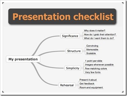
This is the summary that you have to remember to make a presentation:

presentation-checklist

These are the four suggestions from Alexei Kapterev to avoid “death by power point”. Create a presentation with key points or power-point, but not a presentation full of bullet-point.

If you want to get inspiration to make an awesome presentation, you should have inspirational slides.


Translated by: Dewi Suryodipuro


Reference:

  • Death by Powerpoint – Slideshare by Alexei Kapterev

Filed Under: Slide Tagged With: Alexei Kapterev, Angela R. Garber, Bullet Points, Creative Slide, Death by PowerPoint, Inspiring Slides

Download The World Best PowerPoint Presentation

April 18, 2013 by Muhammad Noer

best-powerpoint-presentation

Do you know the difference between a mediocre presentation and an extra-ordinary one?

Mediocre presentation usually filled up with text everywhere. It uses bullet point as a standard template and often boring.

Whereas, an extra-ordinary presentation has the capability to catch the audience attention through pictuces that communicate, text that make you think, and has a strong message.

To see how the best PowerPoint presentation looks like, I have chosen 3 presentations, which considered as “The Best Presentation” in Slideshare.net

Enjoy and download below presentations for your reference.


1. SMOKE – The Convenient Truth

This presentation has won the 2010 Best Presentation Award in Slideshare.

This presentation talks about big impact of smoking and facts behind the cigarette fumes. It unveils the topic with interesting picture. The consistency of using simple colours palette creates harmonious presentation from the beginning to the end.

This world-class presentation contains limited text. By using the right picture and appropriate text, this presentation has the ability to connect directly to the audience.
SMOKE – The Convenient Truth [1st place Worlds Best Presentation Contest] – EP

View more presentations from Empowered Presentations, Presentation Design Firm – Honolulu, HI

Download This Presentation (38 MB)

It’s evident to admit that such presentation has great design, thus makes its creator as world class designer. From this presentation, you can learn how to present your ideas using a story, and describe it through pictures.

Besides, you could also learn the important principles in designing a presentation, such as contrast, harmony, repetition, alignment and focus.


2. American Healthcare – A4 Napkins Explanation

This presentation won the 2009 Best Presentation Award in Slideshare.

An interesting presentation doesn’t always use high-resolution picture or well-designed text. You can create a great presentation using simple sketch or illustration.

As you can see below, this presentation brilliantly uses simple illustration to describe a very complex issue. This presentation explains the relationship between healthcare provider, insurance company and people who use both services.

Healthcare Napkins All

View more presentations from Dan Roam

Download This Presentation (4 MB)


3. THIRST

This presentation won the 2008 Best Presentation Award in Slideshare.

The presentation explains how the world faces the thirst of clean water. The strength of this presentation is laid on the combination of using the right pictures and simple keywords. Therefore, this presentation is able to tell a story, which emphasizes the importance of water subsistence for human being and how our world is now facing the crisis of clean water.

From this presentation you could learn how to combine pictures with the right keywords to explain an idea.

THIRST

View more presentations from Jeff Brenman

Download This Presentation (8 MB)

What do you think?

What make the presentations above so specials?

What have you learnt from the best PowerPoint presentation?

Filed Under: Slide Tagged With: American Healthcare – A4 Napkins Explanation, Best Keynote, Best PowerPoint, Best Presentation, Best SlideShare Presentation, Smoke The Convenient Truth, Thirst

  • 1
  • 2
  • Next Page »

Cart

About Best Presentation

noer-gravatar[1]

BestPresentation.net provides tips, techniques and tricks for you to deliver a world-class presentation. Written in simple language, you’ll learn how to create amazing presentation in every occasion.
Click to learn more...

Latest Post

  • How to Reduce PowerPoint File Size: 3 Quick Tips To Help You Out
  • Want Your Audience Keep Listening to You? Check This Out!
  • Start Your Presentation with Villain
  • How to Use Storytelling in Presentations
  • 5 Things to Remember Before Doing Online Presentation
  • The Simple Tips for Your Presentation from the World Class Presenters
  • How to Avoid Boredom in Delivering Same Topic Presentation Frequently?
  • Why Smiling is Good for You When Giving Presentation?
  • 7 Tips How To Communicate At The New Workplace
  • Who Said Introverts Can’t Be Great in Public Speaking?

Categories

  • Article (45)
  • Slide (7)
  • Video (4)

About Us

Best Presentation is aiming to give you practical tips on how to create a great presentation. We believe everyone can learn how to create a better presentation, deliver a great speech and show amazing visual slides.

Products

We created wide-ranging presentations template products from Inspiring Slides to Powerful Business Presentation. Click below for the products:

  • WOW Presentation
  • Inspiring Slides

Contact Us

Email:
support@bestpresentation.net

Address:
Level 38, Tower A, Kota Kasablanka
Jl. Casablanca Raya Kav 88
Jakarta – INDONESIA

Home Top – Download

home-download-world-class-slide

Recent Post

  • How to Reduce PowerPoint File Size: 3 Quick Tips To Help You Out
  • Want Your Audience Keep Listening to You? Check This Out!
  • Start Your Presentation with Villain
  • How to Use Storytelling in Presentations
  • 5 Things to Remember Before Doing Online Presentation

Copyright © 2025 · Outreach Pro on Genesis Framework · WordPress · Log in